AILEEN NIIZAWA : : ART DIRECTOR + GRAPHIC DESIGNER
Brand Identity • Packaging • Marketing Campaigns • Print & Digital • Environmental Design
Matchbook
Wine Company
Packaging, brand design,
and marketing
Working closely with the owners of Matchbook Wine Company, I oversaw design and production for seven wine brands—from labels, capsules, corks, and case boxes to tech sheets and print and digital marketing materials. My role extended from concept development through vendor coordination, press checks, and final production.
The owners encouraged creativity and experimentation, creating opportunities to explore unexpected interpretations of the signature flame. The challenge was balancing that creative freedom with cohesive, recognizable brand identities that could adapt successfully across packaging, print, and digital platforms.

Olive Oil Label Design - Produced from olives grown on the Matchbook property, this small-batch olive oil was created for cooking and offered through the winery’s online store.
The bottle was selected for its substantial, tactile feel and beautifully distinctive shape. Its dark glass also helps protect the olive oil from light, preserving its freshness and quality. Because the bottle’s softly rounded shoulders already created such a strong visual presence, the label design was intentionally kept simple. The clean, fresh aesthetic complements the unique silhouette while allowing the handcrafted quality of the olive oil to take center stage.

Business Cards - Designed to open like a traditional matchbook, these interactive business cards gave the sales team a distinctive and memorable introduction. A small die-cut notch kept each card securely closed, while the textured paper stock and a hand-drawn interpretation of the flame added warmth, character, and tactile appeal.
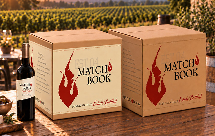
Case Boxes - These retail-ready case boxes were designed to showcase the Matchbook brand while giving the packaging a warm, rustic feel. Distinct color treatments differentiate the red and white wines, while the signature flame icon creates a strong presence in store displays. A short brand story on the side panel adds interest and ensures the cases remain visually engaging from every angle. Credit: Label art direction, Carole Goulding.
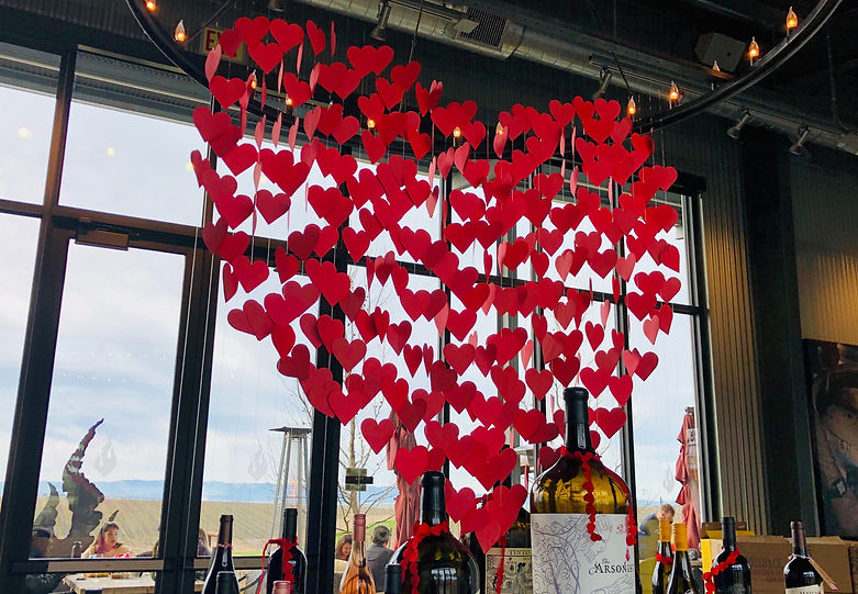
Valentine's Tasting Room Installation - Designed a large-scale seasonal installation suspended above the central display table in Matchbook Wine Company’s tasting room. Custom crossbars and clear fishing line supported layers of floating hearts, creating an open design that preserved views through the tasting room while providing a memorable, photo-worthy moment for guests
to share.